
Energy visibility
Bring meters, plant demand, air temperatures, fan status and trend indicators together so wasted energy can be spotted before it becomes another expensive month.
BMS graphics and live dashboards
Custom graphical views can be designed around the way each building works, showing energy use, plant condition, alarms, setpoints, LoRaWAN sensor values and control behaviour in a way operators, engineers and managers can act on.
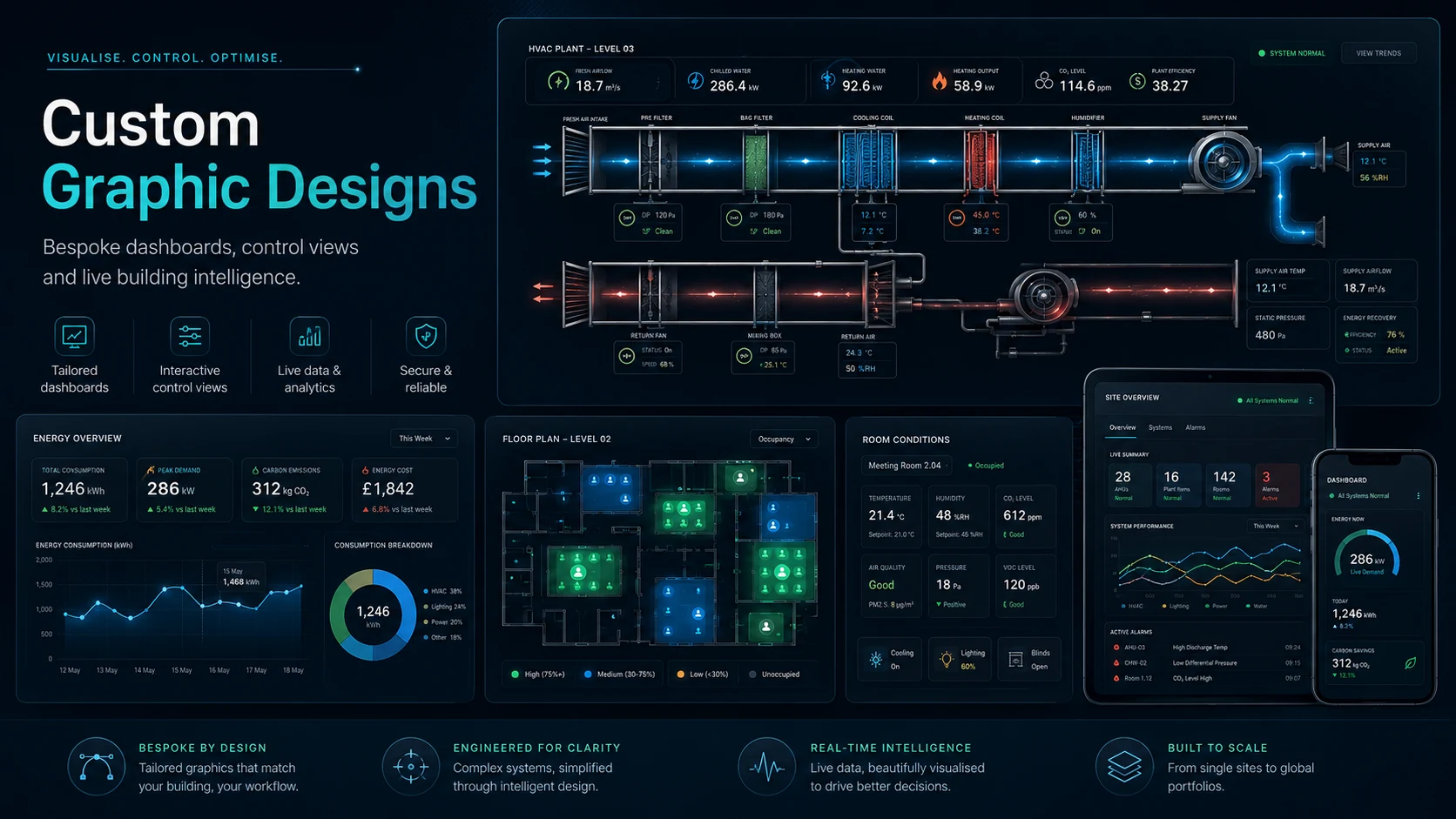
Bring meters, plant demand, air temperatures, fan status and trend indicators together so wasted energy can be spotted before it becomes another expensive month.
Show setpoints, schedules, valve positions, damper states, fan speeds and control modes in one place so users can see what the system is doing and why.
Give remote engineers the evidence they need to diagnose faults quickly, advise site teams and support 24/7 packages with better context.
Custom designs available
Instead of giving every customer the same screen, the graphics can be configured to match the plant, the users, the reporting package and the risks that matter most.
Animated dashboard examples
These examples show the type of live pages that can be built around a site. The final graphics can be configured to suit Niagara, Trend, Siemens, Schneider, Distech, Priva or other BMS platforms where live points and trend data are available.
Example 1
This type of page makes energy use visible. It can combine meter values, plant demand, heating and cooling loads, supply and extract conditions, fan operation and trend summaries in a single operator-friendly screen.
Example 2
This type of page explains how the system is controlling. It brings setpoints, schedules, control values, fan states, damper and valve demands, alarms and maintenance actions into one structured view.
Graphics can be kept simple for operators or built into a deeper engineering dashboard depending on the site package, plant type and reporting requirements.
Simple building or floor-plan view showing temperatures, alarms, plant status and key user controls.
Meter values, runtime checks, peak loads, out-of-hours operation and energy-waste indicators.
AHU, boiler, chiller, pump, FCU or VAV pages showing real control states and safe adjustment points.
Temperature, humidity, pressure, CO₂ and alarm views for pharma, medical, museum, archive, music or broadcast spaces.
Pages arranged so remote engineers can quickly inspect alarms, trends, setpoints, overrides and plant operation.
Graphic and trend views that support high, medium and low risk findings in the monthly engineer-led report.
Wireless health, comfort and energy sensor values can be displayed on dashboards to show problem areas without heavy wiring works.
The best BMS graphics are not just nice images. They are a working tool for engineers, facilities teams and customers.
Use real BMS values such as temperatures, humidity, CO₂, meters, fan speeds, valve positions, damper demands, LoRaWAN wireless sensors and alarm states.
Arrange the plant in a way that follows the real air, water or energy path so faults can be traced quickly.
Use history data and thresholds to highlight abnormal operation, comfort drift, out-of-hours running and energy waste.
Use the graphics during remote support and monthly reviews to identify risks, suggest improvements and check that changes worked.
Static page example
A clear BMS graphic should show the plant sequence, live values and maintenance controls without making operators hunt through several pages.
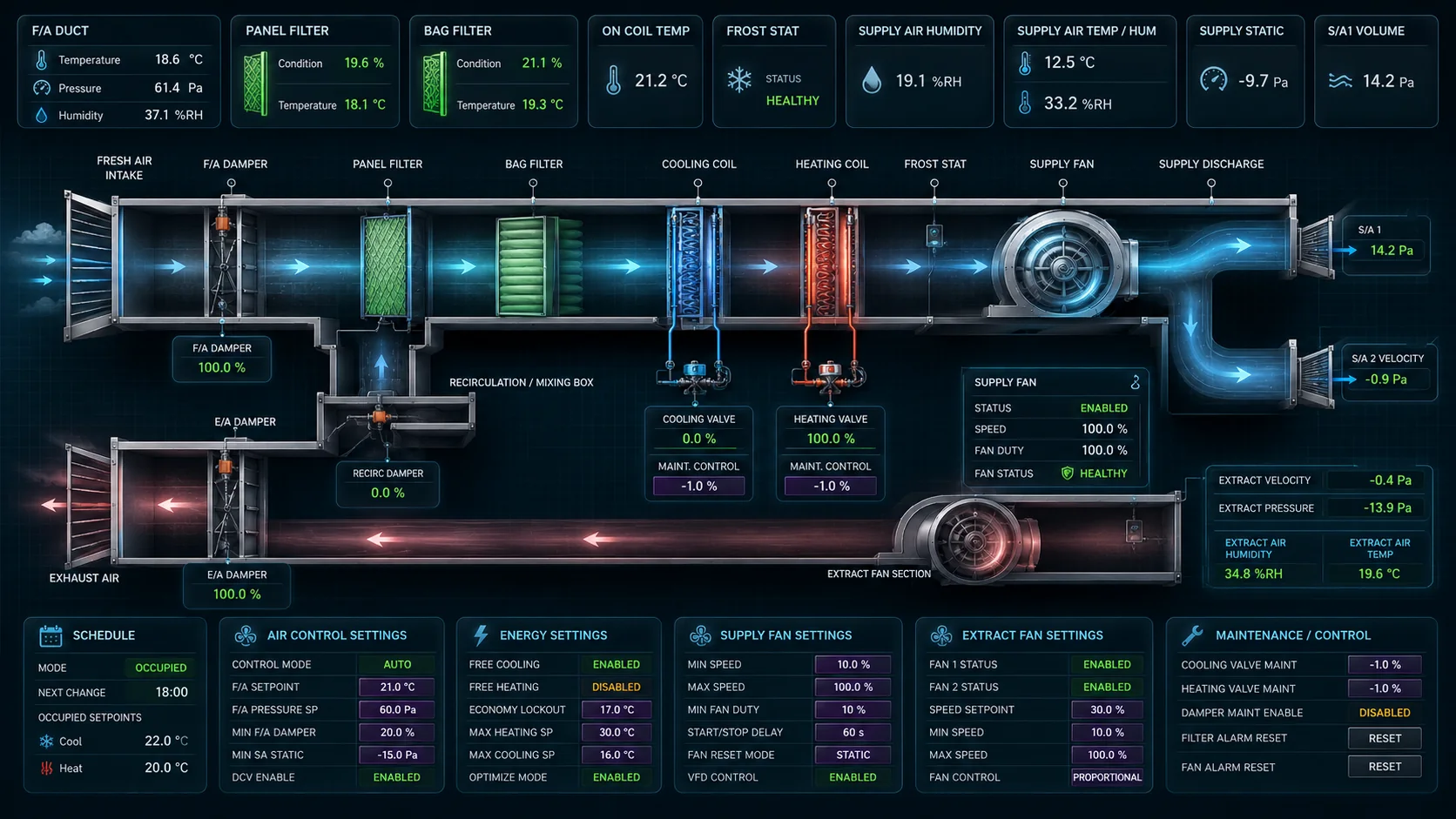
For customers taking Remote Building Intelligence packages, these dashboards can be used as part of energy monitoring, 24/7 response, critical-condition monitoring and monthly engineer-led reports.